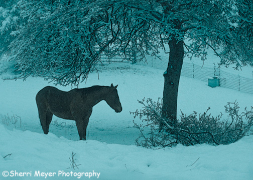
A cold, lonely horse in a pasture in our rural Auburn, California neighborhood. This photo was captured during the "Big Sierra Snowstorm" last week.
You must be thinking what a silly title for a post. I agree. I had a hard time coming up with one. In fact, I nearly asked for help. Then, I had one of those “ah ha moments” and decided to call it “Cold Tone Horse,” because that is the treatment I gave this image when I developed it in Adobe Photoshop Lightroom 2.
The original image lacked something for me and I wanted to do something different. Since this horse appeared to be cold, I decided to add to the cold look by using the Preset “Cold Tone” in Lightroom.
I have 2 questions for you:
- Can you figure out what other 2 creative techniques I used in Photoshop CS3 to create this image?
- Does it work for you?
Thank you for visiting. If you would like to leave a comment, simply click on the “comments” link (add your message in the box) at the bottom of this post.

The horse definitely looks cold, Sherri, so I think the name works. 🙂
Cool pic!
After I left a message, I read the notes above, so I’ll leave you another comment. I’m not sure what you did in PS unless it was to use a layer mask & color balance. It doesn’t look like you used any of the artistic filters so, if that’s not it, I don’t know. Does the image work for me? Yes, it does. I like the coolness, but I might have used a more true blue instead of blue-green. Or maybe it just looks that way on my laptop. Anyway, I do like it. Great job!
I think you used either a photo filter or a split tone type of thing.
I agree with Carolyn. The blue is a good idea but it’s kind of overdone and too blue-green.
Also, if I’m being honest, which I assume you want, I think that the image is too busy. I would have cropped out the right side of the image to the tree. Take out the fence, the box, and the most of the fallen branch. Frame the horse with the trunk, the branches above, and the edge of the image.
I like the subject, the cold horse and the snow. It’s just a bit busy and unfocused for me.
You asked. 🙂
Thanks for your comment Carolyn. Well, yes, I did use one of the artistic filters. I used “Poster Edges.” I also used the distortion filter “Spherize” to bring the horse in closer and to somewhat frame it. Have you ever experimented with distortion before? It’s kind of fun. You can go a little too far with it as I may have done here, or you can add just a little and make it look more like it has a natural canopy around the subject as I have done in this photo http://sherrimeyer.com/Blog/?p=4018. The blue-green color is straight from the preset, but I added some Vibrance to it.
Mark – thanks for chiming in. Please see my reply to Carolyn to learn what I did in CS3. I agree with you about the image being too busy. That’s not the way I normally shoot. Please read on to see why I didn’t.
How this image was captured: I was walking my dog, talking on the cell phone and taking this photo at the same time. I also had a cyclone fence in front of me to avoid and too short of a lens = difficult circumstances. I’m not big on cropping later (especially that much), so I will just have to settle for this one. 🙂